Google News Material You and tablet redesign rolling out
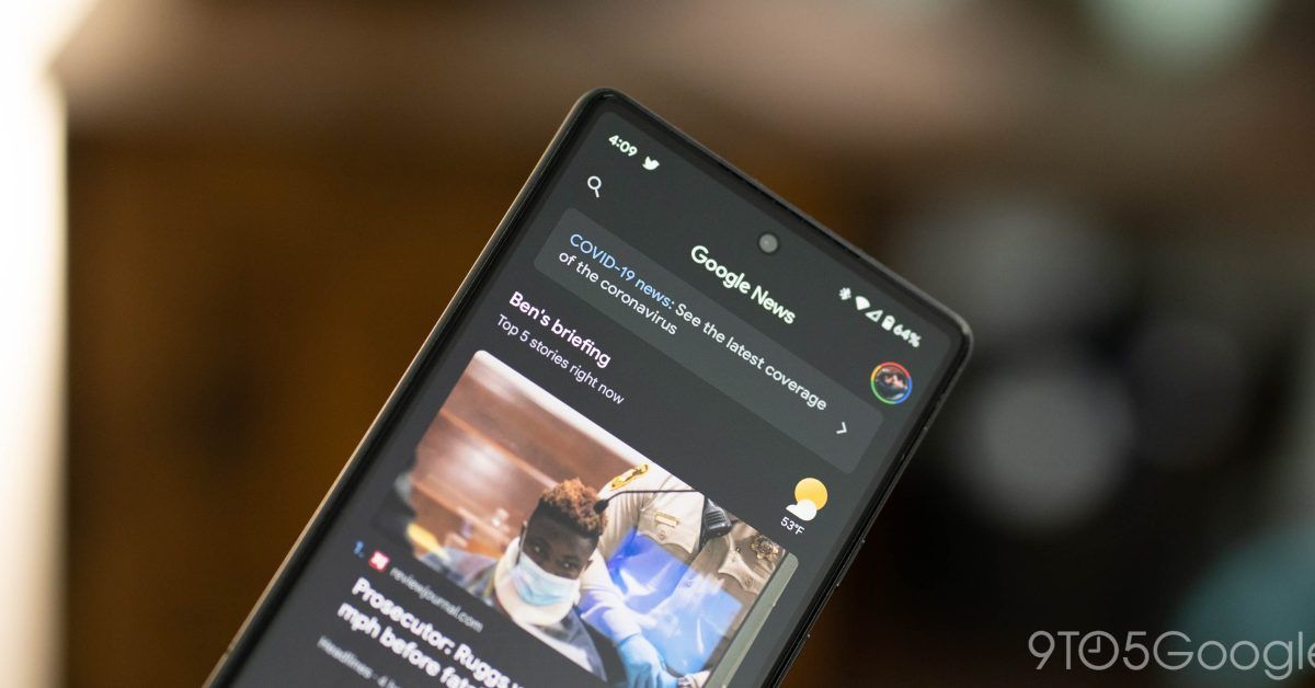
Google News for Android is the latest first-party app to get a Material You redesign, as well as tablet and large screen optimizations.
It starts with a Material You bottom bar that uses pill-shaped indicators to note your current tab. Dynamic Color is not being leveraged here and blue is used as the default accent color throughout the app.
On tablets, a navigation rail is implemented on the left-side of the screen that merges into the app bar with search, “Google News,” and your profile avatar. That top element disappears as you scroll, but the framing effect remains for content as the rail nicely merges with the system status bar. When the dark theme is enabled, content is displayed on a darker background than the rail.
Meanwhile, content extends edge-to-edge compared to previous iterations, which had side borders framing the main feed. This allows for larger cover images and a bit more text to appear.
Overall, the app on tablets is most reminiscent of Google TV’s revamp.
At the moment, we’re only seeing the Google News Material You redesign on tablets with version 5.78. This is a server-side rollout.
Google News was one of the last major first-party holdouts as we wait for the Google app to finally roll out its Material You bottom bar. Other elements in Search, like main settings and the account switcher, have recently been updated.
More on Google News:
Source: 9to5Google


