This is what Google’s new weather app looks like on phones
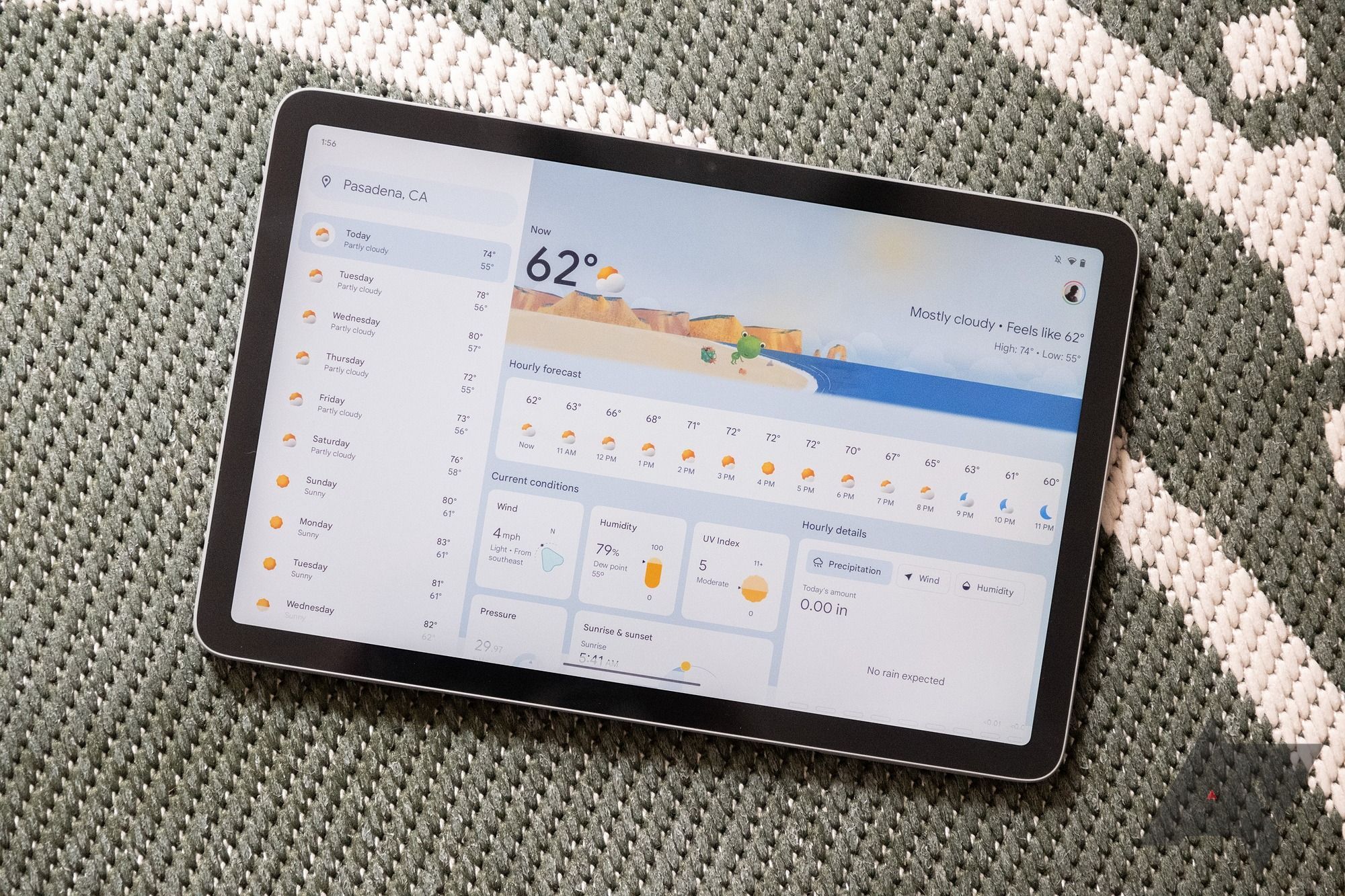
Google added a little surprise with the launch of the Google Pixel Tablet: A brand-new weather forecast that looks a lot more modern and makes better use of the big screen than the old phone version. It looks like Google is planning to bring this new look to phones, too, as tinkerers have already managed to activate the redesigned weather interface on the small screen.
ANDROID POLICE VIDEO OF THE DAY SCROLL TO CONTINUE WITH CONTENT
On the Pixel Tablet, the weather forecast is still part of the Google app itself. That means there isn’t a dedicated app update to download in order to get started with the new design, but it also allows developers to peek into the new design more easily. The Google News Telegram channel managed to activate the redesign early and shared a video of what it looks like on phones.
At the top, you still see the familiar search bar, showing your current location or the place you’ve searched for. It’s a more modern bar, though, with rounded corners and a Material Design 3 blue color. Below it, you can prominently see the current temperature and an icon depicting the weather conditions, along with high and low as well as "feels like" temperatures. A playful graphic featuring the Google Weather frog mascot rounds out the top section.
The new look completely gets rid of the tabbed interface separating today’s, tomorrow’s, and the next 10 days’ weather forecast, though. Instead, there is an hourly forecast right below the aforementioned top section, showing what weather to expect in a side-scrolling carousel, rounded out by a 10-day forecast right below.
When you scroll on, you can see further details on the weather, including the wind speed, humidity, UV index, pressure, sunrise and sunset, and more hourly details on all these stats. Tapping a day in the 10-day forecast then sends you to a dedicated forecast section, with today and the following days arranged in a carousel at the top. You can then tap individual days for more details, with an interface much in line with the weather forecast’s home page.
There is even a fully fleshed out dark mode, which inverses much of the colors all while still keeping the weather frog graphics intact and true to the current time of the day.
Given that the interface already looks all but finished and is clearly optimized for small screens, we can only hope that Google is soon rolling out this redesign to everyone. Right now, it doesn’t appear that it’s rolling out on its own. This would make sense, especially since we’ve seen first glances of this redesign as early as the beginning of May. In the meantime, some of the best weather apps out there may not look as pretty as that, but they may just provide better data.
Source: Android Police


