Google on what makes good foldable and Pixel Fold apps
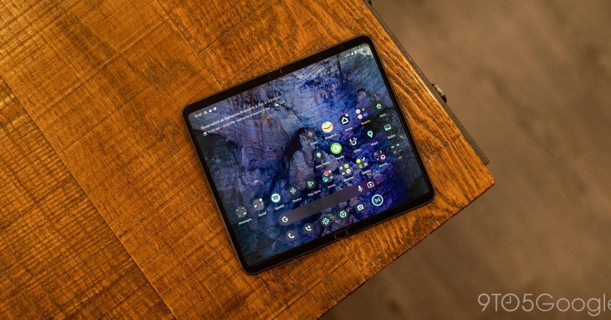
With the launch of the Pixel Fold (and Tablet), Google is continuing the push to get third-party developers to update their apps for foldables.
Google has three design principles to “make the most of the extra screen space on large screen Android devices”:
Two-pane layouts display content across two columns, showing you more content across the unfolded, larger screen, and allows you to do more without extra taps or losing context App continuity on foldable phones ensures apps easily transition from folded to unfolded orientations Responsive layouts resize content and controls as the screen size changes, such as when you use two apps in split-screen mode
The ability to “do more without extra taps or losing context” is indeed the benefit of two-column designs, but windows resizability remains important for split-screen mode. Meanwhile, continuity is crucial for ensuring the screen switching experience isn’t frustrating and doesn’t reset states.
Google today highlighted “five apps that employ these important design principles for foldable devices.” Two are first-party applications:
When you open your foldable phone and use Google Keep, the app transitions to a two-pane layout. You can easily see all your notes at a glance on the larger screen, quickly scan the left pane to find the note you need, and then edit it on the right. Keep also has the added benefit of a toggle to allow you to expand the list of notes to the full screen, giving you the ability to switch between the kind of view you want.
Updated last year, Google Keep is great to use, though there’s no fullscreen notes view. Rather, the note grid is displayed in the background and somewhat distracting.
When your phone is folded, Google Weather shows you today’s forecast on a single screen, and when you unfold your phone, the screen adapts to show more information in a two-pane layout. The left pane shows the 10-day forecast at a glance, and the right pane shows the hourly forecast, wind parameters, humidity levels, and other information for any day you select from the left pane. This lets you get the big picture of the week’s weather while also getting specific details, such as when you’ll need an umbrella for your night out.
Google Weather, which is debuting on the two new Pixel devices, is the other example.
On the third-party front:
“SideChef, a cooking and grocery app with over 20,000 recipes, uses the larger screen on a foldable phone to show you step-by-step instructions for recipes. When you’re cooking, you often need to multitask, so SideChef automatically resizes when you use the app in split-screen mode: on the right side of the screen, you can see the recipe, and on the left side, you can pull up a timer to keep track of the remaining cook time for a dish in the oven. Or, you can pull up a calculator to convert measurements. This split-screen mode helps you stay in the flow and never lose sight of your next step in the recipe.”
“LINE, an app for calls and messages, smoothly transitions when you switch from using your foldable phone in a folded to unfolded state. When unfolded, LINE adapts to a two-pane layout, so you can see all your active chats on the left and the details of your conversation for any friend you select on the right. This layout makes it easier to keep track of all your conversations at once, and you can toggle between conversations with fewer taps. If you’re juggling multiple conversations, you’ll be able more easily see new messages and quickly switch to the chat you want to focus on.”
“Deezer wanted to redesign its apps on foldable phones to create an optimal listening experience and help fans connect with music on a deeper level. With a new two-pane layout, music fans can access more than just the player controls on the screen. Listeners can now see the artist’s album art, sing along with lyrics on the screen, and spread the word about their favorite artist by sharing songs with family and friends in just a click.”
Source: 9to5Google


