Google Pixel Fold: The Morning After
Well, I’m surprised to say that I like the Pixel Fold a lot more than I thought I would. Less surprisingly, my wife is in love with it, as she’s wanted a folding smartphone since Samsung announced the first Fold. So it will be interesting to see where we end up.
In the meantime, I wanted to provide an update on my experiences with the Pixel Fold. I have nothing negative to say, at all—again, surprising—but there is an interesting learning curve, of course, more of a lane shift, I guess, in transitioning from a traditional smartphone to a folding phone. It’s actually kind of fascinating to me.
Anyway, as you might expect, I spent a chunk of time yesterday just updating and installing apps. When I switch to a new phone, I have a long list of apps that I install, and then I arrange the apps I use the most often in a specific home screen layout. With the Pixel Fold, the switch is temporary, as I will be returning this unit even if my wife or I do decide to use one because we’ll want to trade in a phone to get a better deal. And so I installed a subset of the apps I use, basically the most commonly used ones.
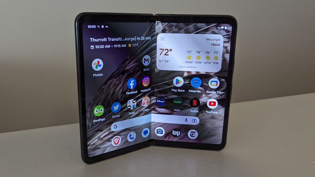
The first thing to understand here is how the Pixel Fold handles the home screen layouts between the outer display, which is like a traditional smartphone, and the inner display, which is a like a wider, squarish tablet. And I like what Google did here: the outer display’s home screen is replicated on the left side of the inner display, while whatever icons you place on the right side of the inner display are only in that one place. Meanwhile, the first four icons you put in the dock at the bottom are likewise replicated on the inner display, but there are also two more icons, on the right, that appear on the dock on the inner display.
This is an excellent system as it replicates the way I like to work, with the most often-used apps most easily available and then a set of secondary apps—video apps plus a weather widget—available only on the display where I would want to access them. It’s exactly right.
Rotating the inner display between landscape and portrait orientations works exactly as it does on the Pixel Tablet, in that it does a tremendous job of handling that transition, and everything onscreen somehow just rearranges correctly. But it’s even better on the Pixel Fold because this device is almost square. So you don’t get that weird long and tall effect in portrait mode as you do on the tablet.
Indeed, one thing I’ve found is that it’s slightly better to hold the device in portrait orientation in reading apps like Kindle. It’s a subtle thing, but it’s just less wide enough, if you will, that it looks and feels more natural.
One potential problem for Pixel Fold users is that you will be more likely to use apps that were designed specifically for the phone than is the case with Pixel Tablet. I used the Instagram example in my review of that device because that app has not been customized to work naturally on a large-screen device and it only offers a phone-style portrait display. On Pixel Tablet, it looks ridiculous, though you can at least open another app side-by-side if you want. On Pixel Fold, it looks less ridiculous because it takes up an even 50 percent of the inner display. You can move it around and use it alongside another app as you do on the tablet, but it’s more likely that most people will simply use this app on the more traditional outer screen exclusively. That’s not an option on the tablet, obviously.
Of the apps I use most often on a phone, there is a mix of those that can handle the bigger display and those that cannot. Google apps like Gmail and Google Photos are obviously customized correctly and work wonderfully on the Fold’s inner display. So are apps like Audible, Kindle, New York Times, Washington Post, Pocket, and Sonos.
But apps like Facebook, Instagram, Twitter, Duolingo, Medium, and others are just phone apps. Some, like Instagram, take up 50 percent of the width. Some, like Facebook and Medium, curiously span to about 65 percent of the display width for some reason. It’s kind of hit or miss.
And you know what? None of this bothers me. It’s a curiosity, for sure. And I will be interested to see which apps evolve over time to better handle large-screen devices like Pixel Fold. But at the end of the day, the Fold is a phone. And most of the time, I suspect, I and other users will simply use it as a phone, meaning with the device unfolded and via the smallish outer display. We will open it when needed: to read, to watch videos, to play games, and so on. It’s like a superpower you can exert when you want to.
I also like how system functions, like the notification shade, Settings, and the All apps view, which appears as a floating pane over the home screen (as it does on Pixel Tablet), have been adapted for the larger display, and the floating taskbar you can access for multitasking purposes is intuitive and obvious. Google has done a really good job adapting Android for folding devices like Pixel Fold, but also for tablets, Chromebooks, and other large screen form factors. The whole thing just feels very natural.
More soon. But I’m loving this thing.
Source: Thurrott.com


