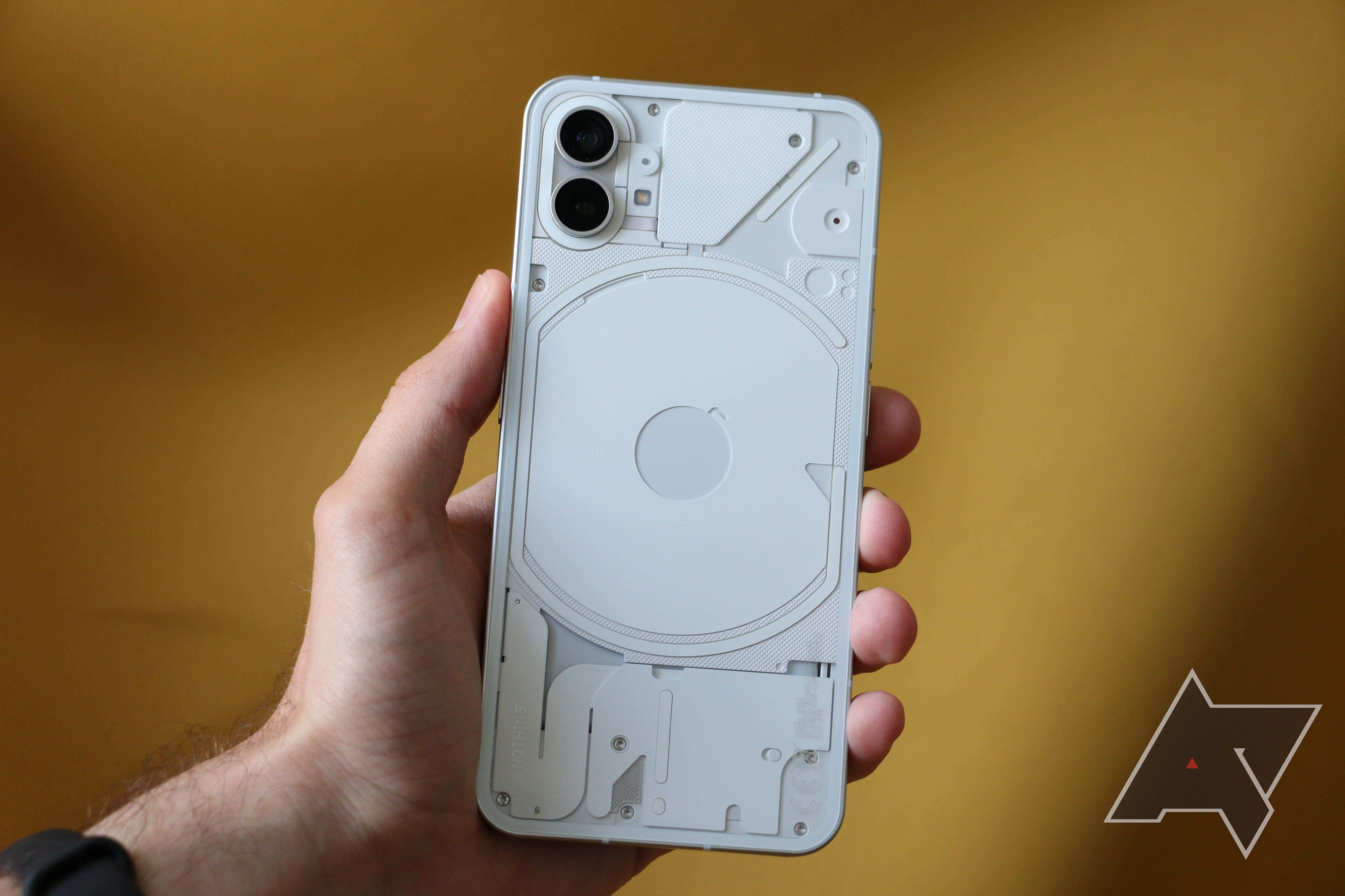
Behold the Nothing Phone 2 in all its pre-launch glory
Carl Pei’s Nothing Phone 1 left quite an impression on us, and the world now eagerly awaits its sequel, with the Nothing Phone 2’s debut slated for July 11. Although the launch is just days away, hype has been building for months, and we have already gleaned quite a bit of info about what to expect, with Pei himself sharing a few key details like the processor and plans for a stateside launch. Now, Nothing and YouTuber Marques Brownlee of MKBHD fame are giving us an early look at the Nothing Phone 2’s hardware design.
Existing leaks managed to bring us sufficient evidence of Nothing's plans tol use a center-aligned hole-punch cutout for the Phone 2’s selfie camera instead of a corner-aligned unit like the Phone 1. Leaker Yogesh Brar recently shared an image of the Nothing Phone 2’s that added support for that idea. We also see this detail in MKBHD’s exclusive hands-on video with the phone, effectively proving another rumor right.
Meanwhile, Nothing took to Twitter to share a teaser image for the Phone 2 showing off the back panel design in both color variations — black and gray. We see the latter in the video, with a thorough look at the new glyph interface.
In his video, Brownlee notes the glass back on the Phone 2 has more rounded edges than the Phone 1 and the shade of gray is way lighter, but the design language overall remains unchanged. The glyph interface light strips are still present in largely the same basic spots, but now split into 11 strips packing 33 controllable zones, as opposed to the Phone 1’s five strips comprising 11 zones.
The old glyph interface of the Nothing Phone 1 (left) gets some upgrades for the Nothing Phone 2 (right)
The exclamation mark-shaped glyph at the bottom still serves as a charging indicator, but Nothing has given the long LED strip surrounding the wireless charging coil a whopping 16 zones. This means apps like Uber can use the LEDs like a progress bar to indicate the proximity of your ride as it approaches. The glyph can also show you the progress of a countdown Glyph Timer without using the primary display, or serve as a volume level indicator.
2 Images Close
The glyph interface strip as a timer (left) and volume indicator (right)
Although the Phone 1 allows configuring the glyph illumination for notifications on a per-app basis, the Phone 2 takes things up a notch with the LED strip in the top-right corner staying lit if you receive an essential notification, like one from your family. You can define the essential apps in the settings menu. MKBHD also shows off the Glyph Composer UI — a ringtone composer utility like the phones of yesteryears, but synced to the glyph interface. Nothing already announced a collaboration with the Swedish House Mafia for a Glyph Composer tone pack, but that isn't visible on Brownlee’s device.
This LED strip stays lit if you receive essential notifications
If you’re interested in checking out these glyph interface features in action, check out the full Noting Phone 2 segment in the video further up. Alternatively, you can wait for our full review of this eye-catching phone.
Source: Android Police


