In iPadOS 17, Apple fixed the worst thing about Stage Manager
When Stage Manager first launched last year as part of iPadOS 16, I turned the setting off as fast as I could and never looked back. It was a half-hearted attempt to build a better multitasking system, with too many quirks and complications that all added up to more clutter and confusion on my iPad.
But this year is different. Ish. I’ve been using the iPadOS 17 beta for a while ahead of the public beta that’s available today, and I have good news: Stage Manager feels much closer to the multitasking system Apple always said it was trying to build. It’s still nowhere near perfect, and Stage Manager still interacts with apps and even other iPad features in odd and confusing ways. But for the first time, I can at least say the iPad is a half-decent multitasking machine.
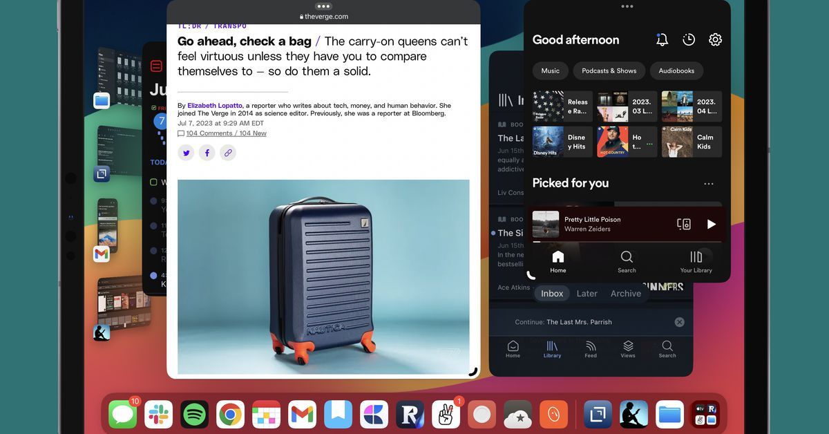
The upgrade that matters is a simple one: instead of having your windows at only a couple of set sizes and orientations, you can now make most apps as tall or short and skinny or wide as you’d like, and you can place them almost anywhere on the screen. Sometimes it looks bad! That’s okay! Choice is a good thing.
As you move a window around the screen, it still sometimes subtly bounces back to the center or the edge, and there are some places — such as way into the corner — that you can’t put an app at all. But it’s close enough. I can have a bunch of small, iPhone-sized windows haphazardly strewn about my screen. I can have a big window playing a video and a teeny-tiny one up in the corner showing the recipe I’m working on. I can drag windows to almost anywhere and almost any size. Stage Manager still isn’t quite fully free-form multitasking like you’d get on a Mac, but it’s a giant leap closer.
I still mostly use Stage Manager for my Messaging Command Center — but now I can lay it out any way I want. Image: David Pierce / The Verge
As with so many new features, Stage Manager only works to the extent that apps let it. Here, I have mostly good news: most apps support the different sizes and resolutions Stage Manager requires. Every once in a while, I do run into an app that either shrinks awkwardly at smaller sizes or just refuses to be anything other than a big ol’ rectangle, though. Netflix is my most commonly used offender: its only layout options are “vertical iPad” and “horizontal iPad,” and shrunk down in Stage Manager, it gets scrunched and small. Some of Apple’s own apps do this, too. But I haven’t found anything that’s just straight-up broken yet.
If you’re a “my iPad is my computer” kind of user, the new Stage Manager is really meant for you
If you’re a “my iPad is my computer” kind of user, the new Stage Manager is really meant for you. For one thing, Stage Manager is substantially more practical to use on a combo of iPad and external monitor than on a tablet iPad alone. You get five stages on your iPad (four on the side plus the one you’re looking at) and five more on your monitor, and it’s super easy to move stuff between them. If you have a stage open on each screen, that’s eight apps in view simultaneously, which is a pretty powerful command center.
If you have a monitor with a built-in or plugged-in camera, like an Apple Studio Display, you can also use your monitor’s webcam when your iPad is plugged in as long as your video app supports it. I don’t have $1,600 to spend on a monitor, so I couldn’t test this. But it’s a nice idea and makes an iPad an awesomely portable video-chat device. (An aside: the iPad is very much turning into a “screen you dock into accessories,” whether that’s a keyboard or a monitor or your TV. I think this is a very cool way to think about the iPad. But I digress.)
Stage Manager is most useful on an external monitor — but let me use more than four apps! Image: David Pierce / The Verge
I can still only have four apps in a stage, though. That’s probably enough for most people — any more and even with small windows, you’re seriously crowding the screen on the iPad — but it feels like an unnecessary limitation for an external display. Besides, I maintain that my clutter is my business, and I don’t need Apple limiting how many things I can see at a time. It doesn’t handle the limitation well, either: you drag in a fifth app, and Stage Manager automatically punts one of the apps currently in your space out to a different one. It gets confusing fast.
Switching between stages is still a bit confusing, too. You can only see four at a time in that left-aligned tray, but that’s not all your stages; swipe up to the app switcher, and you can see all the ones you’ve created. Which I love! But I wish I could have an app in more than one stage at a time — I’d like to have my notes app in one stage with my calendar and to-do list, another next to my browser, and another next to the Kindle app, just to name one example.
Stage Manager still has nothing to do with the rest of iPadOS
Really, my biggest remaining gripe with Stage Manager is the same one as last year: it has nothing to do with the rest of the iPad’s software. You can’t Command-Tab through spaces, spaces don’t show up in your dock, and you can’t save a space in any meaningful way. As ever, the app switcher is the only useful way to navigate your spaces. If you’re going to use Stage Manager, my recommendation is simple: make five spaces and stick with them. If you find yourself needing more than you can see on the screen at once, Stage Manager isn’t for you.
The app switcher is great with spaces — more like this, Apple! Image: David Pierce / The Verge
I suspect that’s why Stage Manager is still mostly an all-or-nothing setting. It’s either on and you’re manipulating everything in stages, or it’s off and you’re back to the iPad’s side-by-side windows and slide-over system. And yet this, too, causes me headaches. I like that with Stage Manager on, I can drag the corner of a window to make it full-screen, then drag it back to see everything else; I don’t really understand why I can’t use slide-over apps when that app is full-screen unless I turn off Stage Manager. A full-screen app should just always act like a full-screen app.
The first version of Stage Manager struck me as a bad solution to a nonexistent problem, a better and simpler way to navigate your iPad that was actually neither better nor simpler. With iPadOS 17, I actually think I see the possibilities here. Particularly for power users, Stage Manager is indeed a faster way to flip between your most-used apps, and if you’re on an external display, it’s leaps and bounds better than any option you’ve had before. Just by giving users more freedom to move and resize windows, Stage Manager feels vastly more useful.
But now Apple needs to make Stage Manager an actual iPad feature. It needs to integrate it with the other iPadOS navigational tools and windowing systems in a way that makes sense. Let me have widgets and apps together in a space! And please, please let me save a collection of apps with a name and then bring it up with a Spotlight search, please. It needs to take advantage of the tablet’s outrageous processing power and actually let you use more than four apps at a time. It needs, in short, to make Stage Manager feel like part of the iPad instead of a wholly separate device that just happens to live inside the same screen.
Source: The Verge


