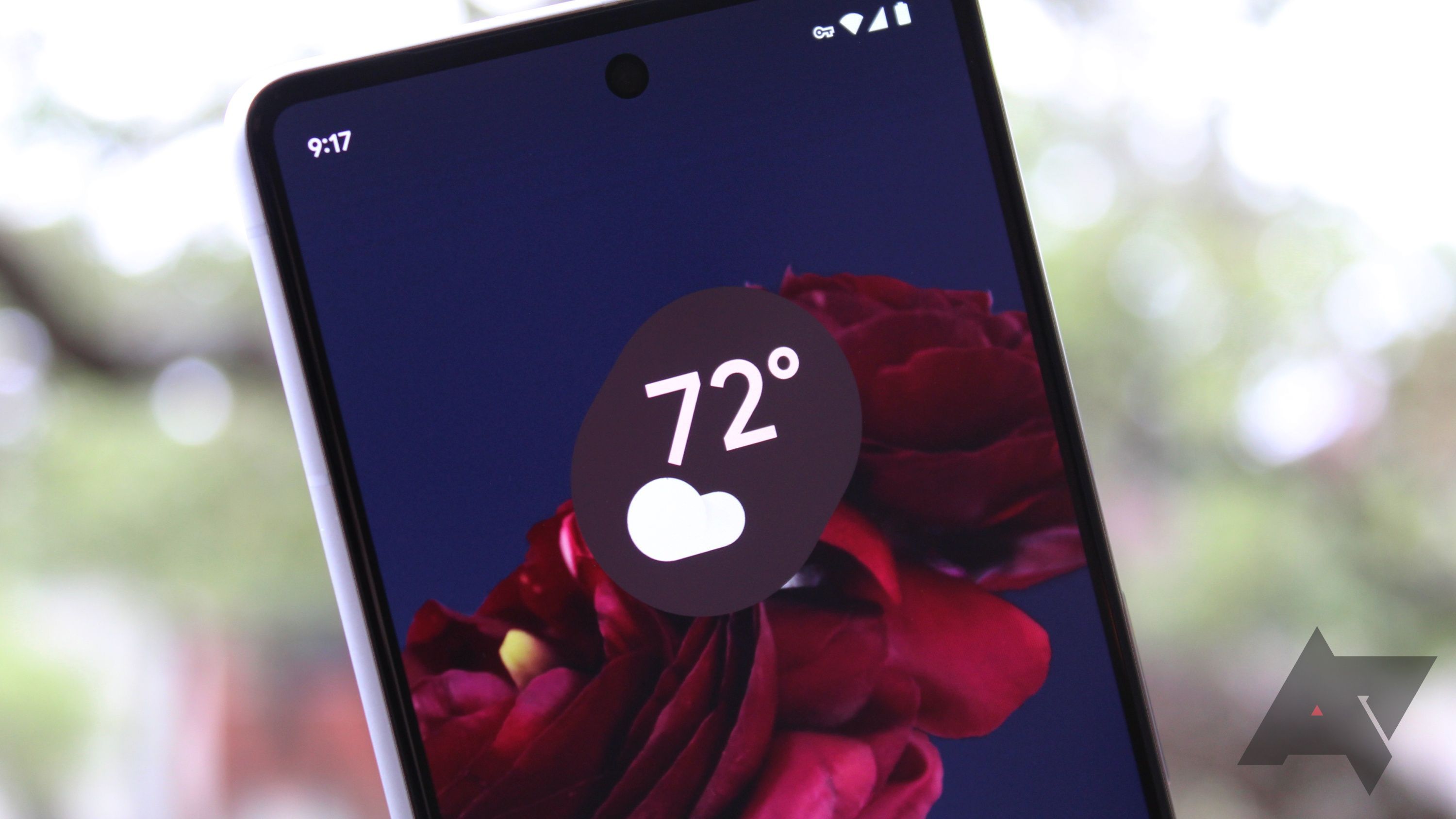
Google Weather's new design features crystal clear forecasts on a fully transparent interface
For the first time in what seems like forever, Google is focusing its attention on improving the user experience of its Weather app. As part of its pending Material You redesign that has already soft-launched on the Pixel Fold and Pixel Tablet, Google Weather is introducing a completely transparent system navigation bar. This update follows design trends visible in other Google apps, such as Chrome, which integrated a similar transparent nav bar back in May. Although this particular element of the update may seem minor, it's clearly an essential component of the eagerly anticipated redesign.
In May, we found evidence that Google was working on the first major makeover for the Weather app since its inception. The outgoing design, which resembles a location-based Google Search result, is being replaced with attractive cards displaying current weather conditions. A pill-shaped search bar and a location pin in place of the magnifying glass icon are two more improvements. The current temperature will show up as a bold, more readable font, and occupy just a third of the screen space in the weather image.
These changes were eventually made available to the Weather app on Google's recently launched large-screen devices, the Pixel Tablet and Pixel Fold. However, the new interface has yet to roll out to phones.
Google's redesigned Weather interface on the Pixel Tablet
Yet, Google didn't stop with the interface redesign — we also spotted the company enhancing the precision and reliability of the Weather app's short-term forecasts. The data is now updated multiple times each hour and comes from the MRMS and HRRR sensor systems of the National Oceanic and Atmospheric Administration. Users will benefit from more precise weather forecasts as a result, enabling them to plan their days with confidence thanks to trustworthy weather data.
Amidst all these significant changes, it was easy to miss the Weather app's newly transparent system navigation bar. As pointed out in a recent tweet by Nail Sadykov, editor of the Google News Telegram channel, content from the redesigned Weather app's vertically scrolling list is now visible in the navigation bar area, obscured only by Android's gesture navigation pill indicator.
2 Images Close
Source: Nail Sadykov/Twitter
This feature, while seemingly small, brings about a refreshing new look and enhanced functionality for the Weather app. Transparent navigation bars have been the dream ever since Android switched from a three-button navigation system to the current swipe gestures, and once enough apps get on board, the rest of the industry will follow. Until then, we'll keep our fingers crossed that Android 14's option to force nav bar transparency makes it to the final stable build in August.
Source: Android Police


