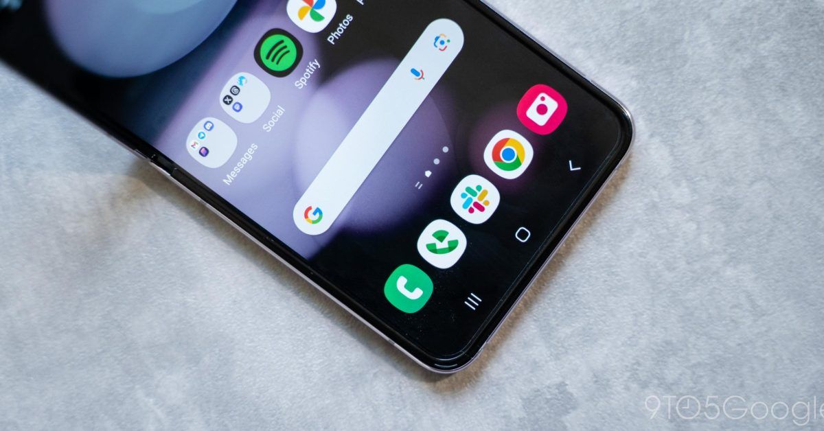
Samsung needs to stop forcing Android 3-button navigation
Navigation on smartphones has changed over the years, but for the past few years, gestures have become commonplace. Samsung, though, is stubbornly still defaulting to Android’s three-button navigation on even its latest Galaxy smartphones, and that’s not really helping anyone.
Three-button navigation great, but Samsung hides the choice
Three-button navigation has been in place on Android since the release of 4.0 Ice Cream Sandwich over a decade ago. The back, home, and multitasking buttons have evolved over the years and between manufacturers. Android’s “stock” layout showed those buttons as listed above, for instance, while Samsung and others often reversed the layout. For long-time Android users, it’s a system that’s engrained in muscle memory, and something that’s admittedly hard to give up.
In 2019, Google introduced Android 10 and, with it, a full gesture-based navigation system that mimicked the iPhone X. A swipe from either side went back, a swipe up goes home, and a partial swipe accesses multitasking. Admittedly, it’s a system that’s unintuitive at first compared to three-button or even Apple’s “Home button” system. But, with time, it becomes a system that feels more fluid and fast by comparison.
That’s why choice is key, and why it’s great that Android actually offers both while Apple limits users to just gestures.
Most Android phones have reached a happy medium with navigation over the years. Phones sold by Motorola, OnePlus, Oppo, and others give you a prominent option to pick between gestures and three-button during the initial setup flow. You literally can’t set up the phone without making that choice.
Google, meanwhile, defaults to gestures on Pixels, but allows you to change to three-button during the setup flow.
Samsung, however, offers no such choice. Galaxy smartphones, even the latest Galaxy Z Flip 5 and Fold 5, still default to three-button navigation during setup and there’s no way to switch until after the phone has been set up. And, even then, you still have to do some serious searching in the Settings to find the option to switch, because it’s not where you’d think.
Admittedly, button navigation can feel a little more comfortable on foldables because of the lip and pre-installed screen protector, but the difference is negligible.
This stubborn decision might cater to some users, particularly long-time Samsung buyers, but that’s not who it needs to focus on.
Android needs to appeal to iPhone users for its own good
Unfortunately, the balance between Android and iPhone is quickly turning in Apple’s favor. Younger generations especially are leaning towards purchasing iPhones and iPhones only. As such, it’s smart for any and all Android manufacturers to make their devices appeal to iPhone users to as much as possible.
Just this past quarter, as smartphone shipments continued to drop, Apple gathered even more of the US market share, while Samsung saw big losses.
Samsung acts as though folding phones is all that’s needed to tempt an iPhone user away, but that can only do so much. Software is arguably more important, and Samsung isn’t really doing much to appeal to those used to iOS – this burying of gesture navigation is only one very small part of the puzzle.
The sad truth about the smartphone market is that, for the most part, users will keep their smartphones in their default configurations. There is definitely a considerable number of people who actually like customize their phones, but most folks just use their phones as they come with minimal changes. Samsung, by setting three-button navigation as the default and not presenting users with an easy step to change to gestures during setup is effectively saying that this is how you should use your phone, and those who switch from a modern iPhone might be put off by that. First impressions are key, and by forcing the majority of users to spend extra time tweaking their device, that first impression is being soured.
Android has the choice in place, but Samsung isn’t doing it right.
More on Android:
Source: 9to5Google


