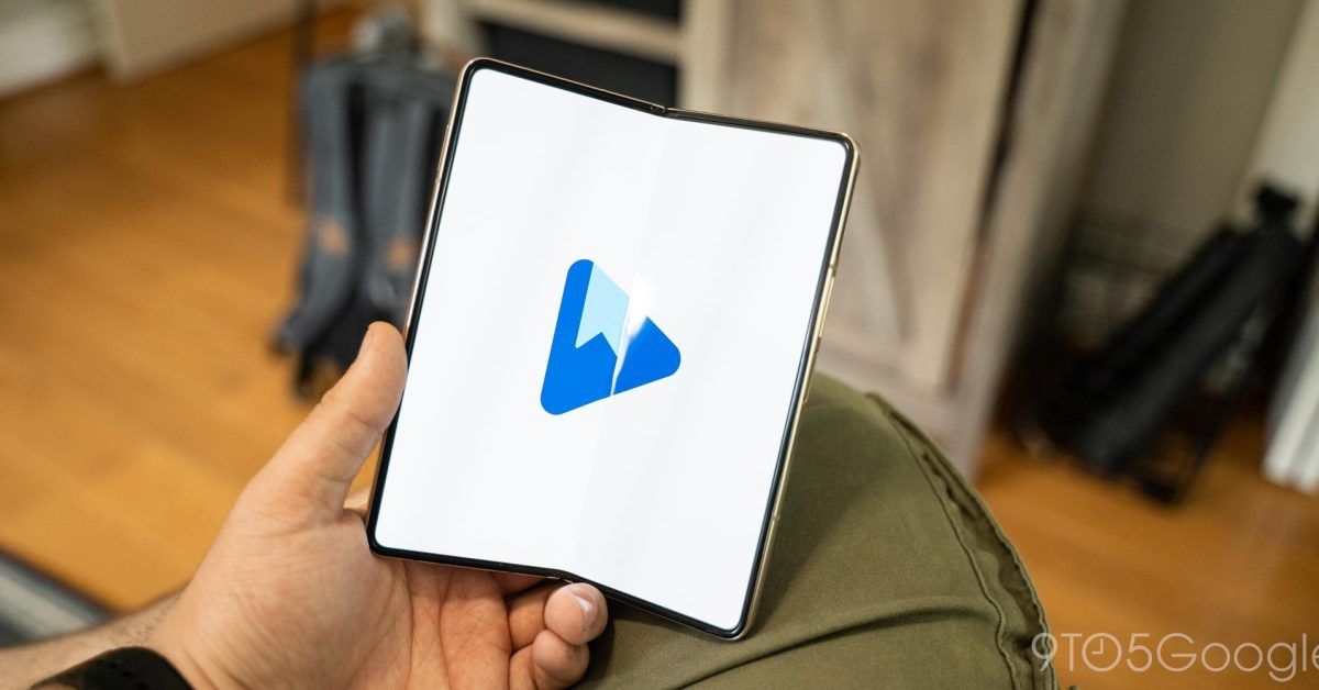
Here’s the new Google Play Books logo
Following new icons for the Play Store and Play Games, it’s now time for Google Play Books to get a new logo, while a tablet redesign is also in development.
To celebrate turning 10 in 2022, Google Play got a new logo with updated colors and tweaked spacing. Similarly, Google Play Games for PC launched with a new icon that came to the Android app earlier this year.
The new icon keeps the triangle shape but rounds the three points much more significantly. Like with Play Games, there’s no longer anything protruding from the triangle, with the book removed. Instead, you just get a bookmark to convey the app’s purpose.
Meanwhile, a darker shade of blue is used, like Play Games, in a refreshing step back from Google app icons that mostly share the same color scheme.
Given that the triangle motif is retained, Google is most likely keeping the “Play Books” name rather than rebranding. There is audiobook support, but otherwise you don’t really “play” a book when reading.
Besides the new logo, which is not yet live but visible in Google Takeout of all places, Play Books is working on a straightforward tablet redesign that implements a navigation drawer. Currently, there’s just a wide bottom bar on Android tablets. We do not currently see Material You elements, save for the widget, in place in a trajectory that matches the Google TV app.
Dylan Roussel contributed to this article.
Thanks Kayvon
Source: 9to5Google


