Tears of the Kingdom is saving me from my checklist obsession
The Legend of Zelda: Tears of the Kingdom, like its predecessor Breath of the Wild, is an enormous game packed with an unbelievable amount of stuff to do. It ought to be overwhelming — but in a twist, it’s actually helping me break one of my most compulsive habits.
I’m busy. Not abnormally so — not any more than you are, probably — but life just fills up, you know? I’ve got a to-do list for work and a to-do list for everything that’s not work. I’ve got precious little time for myself and a million things I want to do with it; I’ve got ballooning lists of things to watch and read and play that I’ll never keep up with. I’ve got apps for logging movies and TV and games and books. I feel compelled to optimize. I’m min-maxing my free time.
Some of these habits are bred by gaming. Think of the sprawling open-world games that parcel out their huge maps and epic narratives in a digestible structure of objectives, checklists, and collectibles. (My friend calls them “UbiJobs,” after the framework of latter Assassin’s Creed games.) My beloved World of Warcraft is basically an infinite to-do list in video game form. It can feel like work, but it’s also satisfying, and it gives you a sense of achievement and mastery — so you try it in life. The designers of gamified apps for micromanaging everything from pocket money to movie-watching certainly learned from this school of design, too.
With me, the habit of turning everything into a checklist has started consuming games that don’t outwardly encourage it. Until recently, the big game in my life was Octopath Traveler 2, a classical RPG with eight parallel storylines that’s light on sub-objectives and tracking systems, and that leaves the player a lot of freedom in how to approach it, beyond the need to keep up with its leveling curve. Yet I found myself making lists for it in my notes app: an optimized order to tackle the quests in, dungeons sorted by recommended level, items to hunt down, and so on.
None of this bodes well for my time with The Legend of Zelda: Tears of the Kingdom. But, just as I was six years ago with Breath of the Wild, I’m amazed at the extent to which the game encourages freeform, organic play, real exploration, and real adventure.
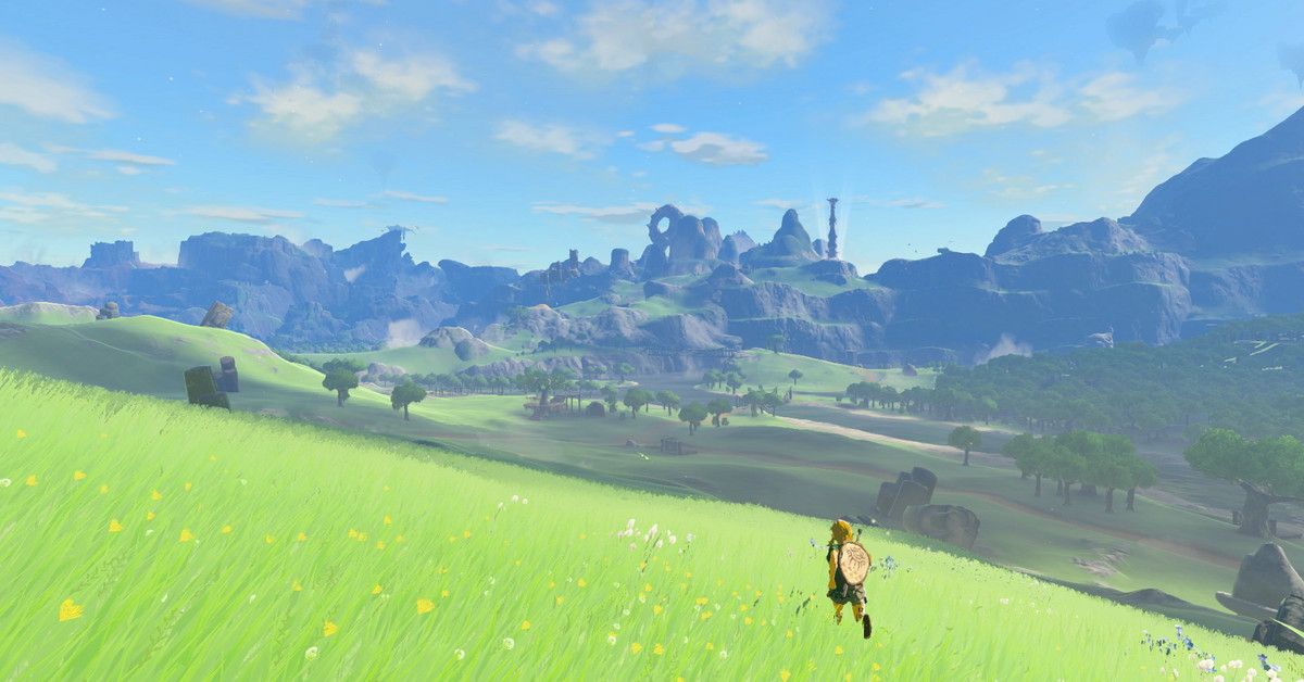
In the evening, I fire it up with maybe two or three objectives in my head — mop up some shrines I spotted, head for the next temple, explore a new segment of the Depths. Three hours later, I’m only halfway toward my first objective, having had multiple surprising adventures and made multiple surprising discoveries on the way. I’ve done things I didn’t have on any list: take down a Battle Talus disguised as a Bokoblin post (and turn its heart into a hammer), enter a skydiving contest, chase fragments of falling stars, tidy up seal plushies. I’ve followed my nose, playing in a naturally inquisitive, experimental, freewheeling style, and I haven’t worried about making progress. I’ve allowed one sidetrack (like exploring a cave) to meander delightfully into another (like building a vehicle to propel a stranded Korok to its friend), taking me far off the route I had planned. I’ve just been present in the amazing world Nintendo has created. As hectic and fun as Tears of the Kingdom can be, you could actually call it mindful.
How did the Nintendo team led by Eiji Aonuma and Hidemaro Fujibayashi do this? I wish I knew — as do many game designers, I’m sure. Breath of the Wild is often called influential, but over the last six years there’s been a notable lack of games that have been able to imitate it, especially in this respect. Few are the open-world AAA games that can successfully disguise the spreadsheets they are built on. If it were easy, we’d have more games that could make us feel like this. But there are a few clues.
Tears of the Kingdom’s world map feels effortlessly natural, but it’s designed with an unwavering focus on sightlines: There’s always a view, and within that view, there’s always something to look at. This is paired with a visual design that emphasizes readability at distance, with clear silhouettes and colorful highlights to draw the eye. With all its clever physics systems, it feels like a teeming, living world, but it’s just as important that it should look like one, too, and that’s where the painstaking craft of Nintendo’s artists comes in. All this was true of Breath of the Wild, and all of it is doubly emphasized by the astonishing verticality of Tears of the Kingdom’s three-tiered world of surface, sky, and cavernous depths.
Then there’s the variety of that world, and the level of craftsmanship in its construction. Unlike so many open-world games, this doesn’t feel like a landscape that’s been populated from a box of cookie-cutter content types. Each enemy encampment, minigame, or cave system is unique, and seems to arise organically from the landscape: Those Bokoblins driving a treasure chest across the prairie in a cart look like they have somewhere to go. I wonder what they’re carrying? Why is that sky island shaped like a giant spiral? You’re drawn to these points of interest, not by a map marker, but because they look interesting; you’ve never seen one like that before. In this context, even Tears of the Kingdom’s grindiest collectathons, like the Korok seeds, don’t present themselves as a to-do list, because they have (in their hundreds!) been so carefully embedded in an already rich world, rather than sprinkled over the map like so much engagement bait.
The new cave systems are a brilliant example of how Tears of the Kingdom constantly leads you astray. Their inviting entryways aren’t portals to mini dungeons that will dump you back at the start upon completion. Instead they lead you into winding underground paths, usually away from wherever you were going. At the end, you Ascend to the top of a new hill, with a new view, revealing new things to investigate.
If you want to further immerse yourself in Tears of the Kingdom, the spartan Pro interface strips away most HUD elements. In its default form, Tears provides a lot of information — but save for one pulsing quest marker on the minimap, none of it is about what to do next. There are map pins you’ve placed yourself (perhaps using your telescope to scan the landscape), there’s the time, the weather, the temperature, your health, your abilities, and your geopositional coordinates. The quest tracker, meanwhile, is fairly rudimentary, and only viewable in the menu.
This tells you what Tears of the Kingdom’s developers think is important: where you are, what the conditions are, and what tools you have at your disposal. Not what you should be doing. That, as with so much in this gorgeous, unpredictable engine of discovery, is up to you. Through their artistry and playfulness, the developers have given me permission to stop optimizing, stop achieving, stop ticking things off my checklists, and just experience the game they made.
Source: Polygon


