Google rolls out new side panel for customizing Chrome
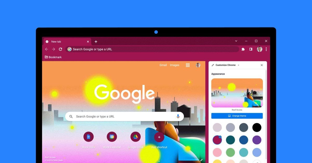
From the desktop New Tab Page, Google prominently emphasizes how you can “Customize Chrome,” and the UI for doing so has been recently updated to leverage a side panel.
The customization options date back to 2019, but it now no longer opens a dialog box that takes up the center of your screen. Instead, Customize Chrome is a side panel like Reading List, Bookmarks, and Journeys, allowing for some UI consistency. The upcoming Reading Mode will also be available here.
Google says this design lets you “easily see how they will show up on your New Tab page as you make changes.”
And don’t worry about saving your work — our new side panel remembers your customization edits as you go.
Appearance is the first section with 15 preset color pairings and the ability to enter your own RGB values. You can also choose a background image from several albums, including those built into Pixel phones or available on Android in Google Wallpapers: Landscapes, Textures, Life, Earth, Art, Cityscapes, Geometric shapes, and Seascapes. Within each, there’s a “Refresh daily” toggle, while there are also collections from Asian & Pacific Islander, LGBTQ+, Latino, Black, and Native American artists.
…if you use Profiles to keep your work and personal accounts separate, try giving each Profile a distinct background and color to differentiate between them.
Shortcuts control the site favicons that appear underneath the NTP search bar. There are options for “My shortcuts” and “Most visited sites.” The last section, Cards, includes recipe ideas, carts, and discounts.
All this comes ahead of the Material You redesign later this year.
More on Chrome:
Source: 9to5Google


