Vizio Launches New SmartCast UI to Modernize Smart TV Interface
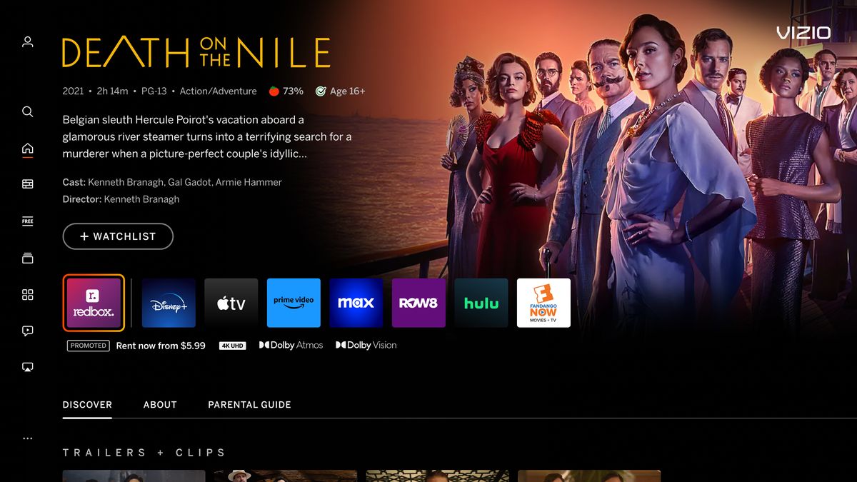
Smart TV company Vizio is more known for its budget screens than it is for a functional, modern UI. Now, the company said it’s finally ready for a facelift, one that’s been a long time coming. Starting on Wednesday, Vizio’s new interface does away with its old box-y look and rearranges icons to make finding apps and content a fair bit easier.
On Wednesday Vizio announced its SmartCast UI that powers the brand’s TVs is being replaced by what’s been dubbed the “Home Screen.” The new UI should be rolling out in an update for all Vizio users with a 2016 model onwards in the coming weeks.
Advertisement
Instead of big blocks of movie posters and apps, icons and logos have been shifted down to showcase a full backdrop image of any highlighted piece of content. At the same time, the UI has been shuffled around to allow more information—including age rating and runtime—for selected movies and shows.
Getting Started | The New VIZIO Home Screen
Perhaps the most noticeable change for Vizio users is that the navigation panel has moved from the top to the left side of the screen. Each selected piece of content will appear with additional landing pages to watch trailers and clips. The UI now shares more options for watching the show, though this also includes a new “Promoted” box to advertise some services over others. The apps otherwise go left to right from least expensive to the most expensive option.
Advertisement Advertisement
For those who hate typing with SmartCast’s elongated single line keyboard, the search function has been transformed into your usual grid format. The tabs themselves have also been reworked, with the “Browse” button now including both genre pages and special hubs like Oscar Nominations and Game Day, for example.
Home Screen’s app row now contains easy access to whatever is currently in the HDMI ports as well as a recent apps button. In addition, the app catalog tab resembles something more like an app store, with promoted services laid out in a more descriptive grid.
Advertisement
All the changes seem very Netflix-esque, but that’s the point. Most TV interfaces have done away with the top bar in exchange for sidebar navigation. This not only makes buttons more clear, but it also allows for more room on the top and bottom of the screen to display content. Vizio’s SmartCast UI has been long in the tooth, and users have long worked to stream through other apps like Roku rather than deal with the clunky, old-timey interface. It seems the top bar’s days are all but gone. Even Hulu has finally caught on and has slowly rolled out changes to its TV apps.
Want more of Gizmodo’s consumer electronics picks? Check out our guides to the best phones, best laptops, best cameras, best televisions, best printers, and best tablets. If you want to learn about the next big thing, see our guide to everything we know about the iPhone 15. Click here to save on the best deals of the day, courtesy of our friends at The Inventory.
Advertisement
Update 06/28/23 at 2:35 p.m.: This post was updated to say the update should be available for Vizio users in the coming weeks.
Source: Gizmodo


