Vizio is giving its TV software a much-needed overhaul
Today, Vizio is announcing a completely overhauled homescreen experience for its TVs that will eventually make its way to models dating back as far as 2016. The new interface looks sleeker and more modern than the company’s existing SmartCast OS. And Vizio went the direct route with branding: the new software is just called Home Screen.
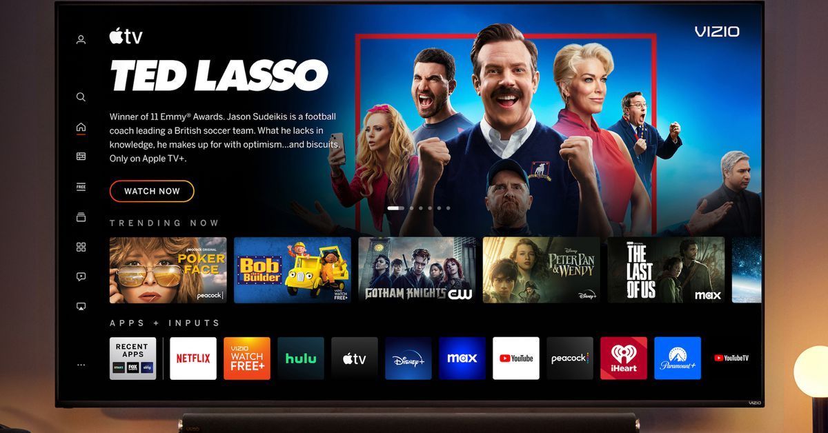
Take one look at the revamped user experience and it’s immediately clear where Vizio drew inspiration from: this basically looks like its own streaming service. All the telltale signs are there. A column of navigation icons on the far left? Check. There’s the usual hero slot at the top with immersive artwork, custom typefaces / logos, and autoplaying video.
It’s much easier to tell at a glance which services your content recommendations are coming from since there are now small badges included with the cover art. Vizio says it will also surface Rotten Tomatoes scores and Common Sense Media parental guidance in the detail pages for shows and movies.
Home Screen comes with its own universal watchlist that can aggregate content across various entertainment apps. But that comes with the usual exception of Netflix, which always refuses to participate in these things. Everything seems more cohesive and intuitive than SmartCast OS. The latter always struck me as a bit cobbled together ever since Vizio pivoted away from its ambitious cast-everything strategy (remember those Android tablet remotes?) and realized that people want built-in apps without jumping through hoops to get there.
Vizio’s revamped TV interface uses left-side navigation like many entertainment apps. Image: Vizio
Home Screen now feels more akin to Google TV with its heavy prominence of recommendations and a customizable app row. (Your TV inputs also appear in this row.) But that left-side navigation is what really makes me think of Netflix, Max, and every other major streaming app under the sun. It’s there you’ll find sections for live TV, free on-demand content, and more.
It should come as no surprise that Vizio will be pushing its WatchFree Plus FAST service, but all the extra features that SmartCast offered — casting, AirPlay, etc. — are still accounted for with Home Screen. The company has also polished up its search experience with an easier-to-use virtual keyboard and added new genre / collection pages with their own carousels of recommendations. The “app catalog” now feels more like a proper app store and has improved discoverability for finding those under-the-radar streaming apps.
The search experience has been redesigned. Image: Vizio
Source: The Verge


